

 Tweet
Tweet
One of the hardest things about making realistic armor .dats is trying to paint them onto a 256x128 pixel canvas. Even trying to enlarge-paint-shrink the canvas doesn’t work very well. So many of your fine details have a tendency to get lost in the process. So it’s best to teach yourself to work with the space that you have.
This tutorial is meant to give you an idea of how to best use the space that you have to make your armor look realistic. I don’t have the room to go in depth into each thing, so I’ll just skim the surface, and make separate tutorials later.
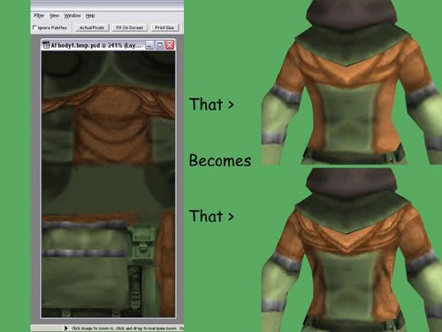
Back to my THF AF. I’m starting with the skin for the tunic. When you pull that out of the Model Viewer, you’re facing two separate bitmaps. One of the hood and one of the body. Now with many of the skins, you may find yourself wondering… “Just where does that GO?†Soooooo…..
#1-Finding your parts.
If you have a .dat (and especially in some of the smaller ones – lizard helm for example) it can get really hard to figure out what goes where on your model. If you have that problem, pull out a new layer and color-code your parts. Use nice, bright colors.
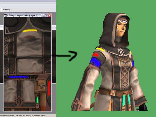
This can also be helpful to figure out how things line up, and how they get stretched. (Note the blue line compared to the yellow.)
#2: Always keep a layer way at the bottom of your original skin – That way, you don’t have to pull out a whole new one if you screw up beyond all repair.
#3- Start out vague. No need to jump right into detailing a skin. Start out by getting your colors right. Feel free to try a few.
Hmmm…the green isn’t actually all that bad. It just needs some work. Now, open another layer and paint in your big shapes. You can use a separate layer for each color if you like. Flatten, save and take a look.
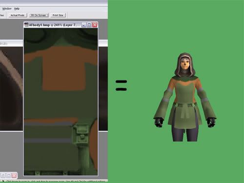
Hey, a skin! Alright…her tail is green and it looks like you wrapped her up in paper, but it’s there. We’ll worry about alpha mapping and the like later. In fact, do that last, unless you need to see part of a skin that’s covered by something else. (Barone armor comes to mind.)
#4- Shading. Here’s the hard part, and where the “Tricks†part of the tutorial really kicks in. The number one-and most important-part of shading is: Your light source is from the top. Said source actually changes in game, and I’ll show you another trick with that, but for now: Shade as if you’re standing under a street lamp. Look at your original skin if you need any guide on that. (That’s why we kept it. Aha!)
Trick #2: Metal
Now…metal is tricky. It reflects stuff in weird ways and insists on looking odd no mater what you do. Especially large areas of metal. Chainmail is a whole new tutorial, but I’ll cover those metal armbands here.
-Take those nice gray bands and select them. Now pull out your burn and doge tools and make stripes. I’m not kidding, honest. Then put an extra dodge along the whole top and a burn along the whole bottom. Ta da. Basic metal shading, or a pretty good impression thereof.
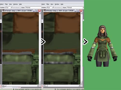
Trick #3: Leather. Leather is not a flat, plain surface. Leather has cracks, leather has seams…Hooray for the noise filter. Pick out a nice light color and a nice dark color and add just a touch of noise to the layer you’re working on. Then Gaussian Blur it just a little. Not too much in either case. Find out what looks good. Then use the burn and dodge tools to put in a couple of seams. Burn in the seam, then add a dodge on either side. Again, we’ll tweak the better shading later.
Other Tips:
-Stark white looks baaaaaad. Use a light gray whenever possible. The white shows up as a glaring empty-looking area ingame.
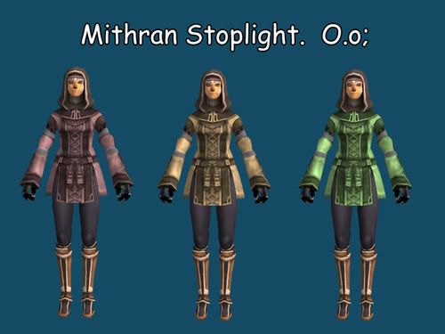
-Along the very edge of your canvas, there’s a 1-pixel-wide strip somewhere that has a tendency to overlap to the other side of your model. That’s why you sometimes see those bikini-wearing mithra with a black stripe down their front. I don’t know why this happens. I’m not positive how to fix it. Just a warning more than anything.
-If, after editing a mesh, you discover that the texture map as been warped, (look at the armbands on the THF mesh for an example. It used to be even worse.) feel free to open it up in Metasequoia again and move the vectors around until it looks right. Nothing is ever set in stone.
Feel free to post questions and other tips of your own in this thread.
Next tutorial: Up to you guys. Vote in the pretty little poll up top, (If it works, that is.) and let me know what you want to see.
This tutorial is meant to give you an idea of how to best use the space that you have to make your armor look realistic. I don’t have the room to go in depth into each thing, so I’ll just skim the surface, and make separate tutorials later.
Back to my THF AF. I’m starting with the skin for the tunic. When you pull that out of the Model Viewer, you’re facing two separate bitmaps. One of the hood and one of the body. Now with many of the skins, you may find yourself wondering… “Just where does that GO?†Soooooo…..
#1-Finding your parts.
If you have a .dat (and especially in some of the smaller ones – lizard helm for example) it can get really hard to figure out what goes where on your model. If you have that problem, pull out a new layer and color-code your parts. Use nice, bright colors.
This can also be helpful to figure out how things line up, and how they get stretched. (Note the blue line compared to the yellow.)
#2: Always keep a layer way at the bottom of your original skin – That way, you don’t have to pull out a whole new one if you screw up beyond all repair.
#3- Start out vague. No need to jump right into detailing a skin. Start out by getting your colors right. Feel free to try a few.
Hmmm…the green isn’t actually all that bad. It just needs some work. Now, open another layer and paint in your big shapes. You can use a separate layer for each color if you like. Flatten, save and take a look.
Hey, a skin! Alright…her tail is green and it looks like you wrapped her up in paper, but it’s there. We’ll worry about alpha mapping and the like later. In fact, do that last, unless you need to see part of a skin that’s covered by something else. (Barone armor comes to mind.)
#4- Shading. Here’s the hard part, and where the “Tricks†part of the tutorial really kicks in. The number one-and most important-part of shading is: Your light source is from the top. Said source actually changes in game, and I’ll show you another trick with that, but for now: Shade as if you’re standing under a street lamp. Look at your original skin if you need any guide on that. (That’s why we kept it. Aha!)
Trick #2: Metal
Now…metal is tricky. It reflects stuff in weird ways and insists on looking odd no mater what you do. Especially large areas of metal. Chainmail is a whole new tutorial, but I’ll cover those metal armbands here.
-Take those nice gray bands and select them. Now pull out your burn and doge tools and make stripes. I’m not kidding, honest. Then put an extra dodge along the whole top and a burn along the whole bottom. Ta da. Basic metal shading, or a pretty good impression thereof.
Trick #3: Leather. Leather is not a flat, plain surface. Leather has cracks, leather has seams…Hooray for the noise filter. Pick out a nice light color and a nice dark color and add just a touch of noise to the layer you’re working on. Then Gaussian Blur it just a little. Not too much in either case. Find out what looks good. Then use the burn and dodge tools to put in a couple of seams. Burn in the seam, then add a dodge on either side. Again, we’ll tweak the better shading later.
Other Tips:
-Stark white looks baaaaaad. Use a light gray whenever possible. The white shows up as a glaring empty-looking area ingame.
-Along the very edge of your canvas, there’s a 1-pixel-wide strip somewhere that has a tendency to overlap to the other side of your model. That’s why you sometimes see those bikini-wearing mithra with a black stripe down their front. I don’t know why this happens. I’m not positive how to fix it. Just a warning more than anything.
-If, after editing a mesh, you discover that the texture map as been warped, (look at the armbands on the THF mesh for an example. It used to be even worse.) feel free to open it up in Metasequoia again and move the vectors around until it looks right. Nothing is ever set in stone.
Feel free to post questions and other tips of your own in this thread.
Next tutorial: Up to you guys. Vote in the pretty little poll up top, (If it works, that is.) and let me know what you want to see.


Comment